
Evolution of the Apple logo
From 1976 to today: names, symbols and finishes
A timeline of the brand, not a sequence of exclusive replacements. Colors and finishes have coexisted across products, media and contexts.
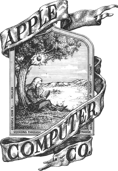
Image file and information 1976The Newton engraving
Apple Computer Company cofounder Ronald Wayne drew Isaac Newton beneath an apple tree, with a Wordsworth quotation around the border. The engraving appeared in the Apple I manual. The following year it gave way to a simpler image suited to small-scale reproduction.
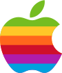
Symbol only; the original word apple is not included. Image file and information 1977The rainbow bitten apple
Rob Janoff, at Regis McKenna, designed the symbol for the Apple II launch in April 1977. Its six stripes referred to color display capability. The bite helped distinguish an apple from a cherry at small sizes. The complete mark could include the lowercase word apple; only the symbol is shown here.
Image file and information 1984The symbol stands alone
Cult of Mac dates the removal of the word apple to 1984, with the Macintosh, and credits Landor Associates with it and small adjustments to color and shape. This is that source’s attribution, not a universal date for every use of the logo. The rainbow apple continued in the years that followed.
Image file and information 1998-1999From rainbow to monochrome
The 1998 iMac already had a single-color translucent apple on its case, while the rainbow remained in software. Cult of Mac dates instructions to dealers to drop the stripes to August 1999. Single-color versions were used according to the medium.
Provisional image: a flat gray symbol. It does not reproduce an Aqua finish or a historical chrome treatment. Image file and information 2000sAqua and metallic finishes
The Aqua visual language of Mac OS X brought glass, shine and dimensional treatments; metallic finishes were also used. Sources do not agree on one date for every finish. These coexisted with flat versions rather than forming a chain of exclusive replacements.
Image file and information 2007From Apple Computer to Apple Inc.
On January 9, 2007, at the iPhone presentation, Steve Jobs announced the move from Apple Computer to Apple Inc. Apple confirms the January 2007 name change in its open-source license. This is a change in the company’s name, not in itself a new logo silhouette.

Image file and information 2013 / 2015 →The flat apple in context
The flat design of iOS 7 in 2013 provides context for this stage; Cult of Mac places another flat-finish milestone in 2015. They should not be reduced to one official brand-change date. The single-color apple continues to adapt to backgrounds and products alongside other finishes.


Company names
Apple Computer Company (1976) → Apple Computer, Inc. (1977) → Apple Inc. (2007)
Size and proportions
Images are sized here for readability, not to represent historical usage sizes. These sources do not provide a complete technical history of proportions. We do not claim that the geometry has remained identical since 1977.
Sources and provenance
Images from Wikimedia Commons, with rights status described on each file page. Wayne’s engraving is identified as public domain in the US; that does not mean worldwide public domain. Apple is a trademark of Apple Inc. This is an independent historical overview.
- https://www.thegraphicdesignschool.com/design-history/apple-logo-history/
- https://www.robjanoff.com/applelogo
- https://www.cultofmac.com/apple-history/apple-computer-logo
- https://opensource.apple.com/apsl/
- https://www.macworld.com/article/183057/applename.html
- https://investor.apple.com/investor-relations/faq/default.aspx